Tuesday, March 14, 2023

FILMING PT 1

WELCOME BACK!! During this week, we have a lot to do because we have five weeks left of the project so it is time to get to work!

But to begin with some good news, we started filming yesterday 🥳 and it went great, however, we couldn’t get all the footage that we wanted because we have a huge competition next week so tensions are high and we couldn’t disturb that much plus it was really noisy as well so we just got shots that didn't require dialogue. In the end, we mainly got all the shots we needed for the end of the film and some for the beginning so I thought this was a good process. 

Here are some of my favorite shots we got. 


Now the idea behind this is that we got some inspiration from the gymnastics movie ‘Stick it’ where there is a scene where she keeps falling and it looks really cool so we tried to recreate that and we shot many shots of our main girl falling from different angles as well but I’ll show you what it is hopefully going to look like. 


Alright, let's keep going, I’m going to show you some really nice shots that we got from our main girl (who doesn’t have a name yet) 


We had so much fun filming and we really liked the shots that we got but don't worry that is only a sneak peek of what we got. And obviously, I couldn't let you go without any bloopers, could I? 


Sunday, March 12, 2023

EDITING TECHNIQUES

 I don't know if I've mentioned this before but when we did our group meetings Ana got a really good suggestion. As you may know, we plan on playing with color in a way that as the movie begins everything is bright and colorful but as the movie progresses and as the mood changes the color will lower and it would end in almost black and white. Now, the student that made the suggestion said that we could play with the saturation of the footage to make that happen. Naturally, I had to research how to do this editing technique that takes place post-production. 

So what is color grading? color grading is when you stylize the color scheme of the footage. In addition, this also happens after color corrections and the purpose of this technique is to emphasize the visual tone and to make it look a little more cinematic. But then the question becomes how do you make this color grading happen? Well, I found an article that had a couple of tips to do so and here they are: 

The first thing you should do is look at the genre of your film because certain genres have developed a certain color wheel that could be a good starting point. The second step is to think about the mood you are going for, and the emotions you want to evoke and use color to support it. The third step is to use the color wheel to show contrast, tranquility, or claustrophobia. There are the tips I found useful when it is time to edit and get this done. 

But that is not everything, I also found an article with a video that tells you how color grading works and what your footage looks like once you get the color grading. 


The video is really useful because it tells you what to do and what it would look like after you accomplish the color grading. it explains in detail everything you need to know about color grading and all the techniques that they use such as log, raw, creative LUTs, etc. But that is not all about the article that shows you this video, the article also talks about the difference between color correction and color grading and they show you the different of what it looks like. 


We see that the first thing that takes place is the color correction, and this is to correct the color of your footage which will lead you to color grading that will change the colors of the footage for aesthetic reasons. But don't think this ends here because I found even more useful information about this editing technique in a new article. The article talks about the 5 steps that you need to take to make color grading happen. 


But then the cool thing about this article is that it shows you a video of the same footage but with different color grading and how the color grading is used to create an entirely different mood making it seem like it is coming from an entirely different movie. This the reason we want to use this technique because as you know the movie is about struggling in a sport which is why we want to lower the saturation as it goes that way the audience sees that the mood is changing and as the stages of life happen and the stages of the girl growing up in the sport happen the tone and mood kinda lower because she is struggling and we thought that using this technique to show that important part of the film was appropriate. 

But nonetheless, we still have so much work to do, hopefully, we can start filming this week and get some things going!!

ARTICLES: 

https://vimeo.com/blog/post/color-grading-vs-color-correction-explained/#:~:text=Color%20grading%20is%20the%20process%20of%20editing%20film%20or%20video,is%20meant%20to%20see%20it.


https://nofilmschool.com/color-grading-guide-2022

Saturday, March 11, 2023

TIKTOK POSTS

Welcome back! As you all know and as I've said before in past posts, we planned to open an Instagram account and a TikTok account for our social media component for this project because we feel like it works best for our target audience. Now, I know what you may be thinking, it may sound like a lot of work but in reality, it's not because of all the challenges or TikTok videos we do we can also post them on Instagram so it is a win-win situation. Now, why am I talking about this? Well, because like everything in this project, it is time to do some research to analyze and get inspired for the kind of posts we would like to do.

I researched the shows “Grey’s Anatomy” and “Abbott Elementary” becase they have really nice TikTok posts that I feel like match perfectly to our target audience. The first thing i noticed about both of these pages is that they post a lot of scenes from the show which i thought we opulent do until we start filming, therefore, i decided to focus more on posts that were a little more audience interactive in a way and something we could record any day of the week. I came across this post from the Grey’s anatomy’s TikTok that I really liked. 

The post is basically asking the cast what they listen to, this way the audience or the people watching may relate to the cast this way and you are creating a connection since the person feels like they have something in common with the person they are watching on TV and if they haven’t seen it and it appears on their ‘For You’ page then it may intrigue them to watch the show. 

For this TikTok they focused on one main character of the show n which he was doing a social media take over and this video he did a TikTok ‘trend’or ‘challenge’ that was going viral at the time, and again it gives everyone a sense of relationship and connection and the people are seeing them as them not just these famous TV stars on a big show. 

Then I checked out Abbott Elementary…


This is a series of TikTok’s that is encouraging people to go watch the show and they do it in a very clever manner. First they did a video on each main protagonist in the show and they did it adding TikTok language trends and the characters personality so it is a combination of the TikTok’s trend and slang and the characters personality which is what makes the show funny. I think this is a really nice way to promote the show because the people that will watch t he TikTok will hopefully be intrigued and interested enough on the show to watch it, so I think we could try to do this for our TikTok account as well as the other posts. 

Well that is it for this blog post, stay tuned for many many more information and progress on our project, time is flying by!!!! 

Friday, March 10, 2023

KEY ART RESEARCH

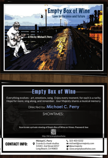
 So earlier this week Ms. Stoklosa gave us a lesson on the third component of the project which is the key art component. Since we are doing a short film we have to make a postcard that advertises the film at ill festivals (hypothetically). Now the post card needs to be double sided and needs to include the title, key art, directors name, date, time, location, and social media info which is a lot of information. Naturally, i did some research to analyze and to get some inspiration in order to succeed on this part of the project. 

Now, I had a hard time researching profesional short film postcards so i went to Ms. Stoklosa’s website and checked out past projects. This is what I found: 


This person did a really good job with the postcard , you can see it h everything they need to have and even more. The front of the postcard is incredibly simple but it does the job, it is not overwhelming you right away, there is not a lot going on, yet, it speaks for itself. Now, the back of it has a little more than the front and it should because the point is for the person to turn the card around and see all the information about the film. Isabella, has again the title and directos name written in the back as well as in the front which adds to the whole constant branding. After that, she has a one sentence summary of the film kinda like the main idea which i would love to add that way people can know what the film is about in a general way but something hat still intrigues them to make them watch. Then she added the cinematographer’s name, the people that are starring on the film, and the editions name, now this I really liked because this isa way to credit everyone that participated in the film not only the director, this is something I would like to add. And lastly, at the bottom she has her information and the QR code for the film’s social media. The only thing I wouldn’t take away from this postcard is her information that she added because I don’t see the point of that. 

The next one i saw was this project done by Paola Sirignano, 


The thing about this one is I don’t think the colors and branding match, on the front side it is black and white and on the back isa mix of black and reds and they are in different directions which I dont match. While doing my postcard I would have to take into consideration the direction fact and that it has to match with the color branding and the whole branding of the project t create consistency. Nonetheless, I feel like for our postcard we could play with the whole and black shade since we plan on using color degrading on our film so maybe we could try and play with that on our postcard which i think she did a really good job on the front side with the black and white. 

NEXT… 


This project was also really good even though it was more on the simple side it accomplished everything a post card should do. To begin with, the colors match and stay consistent which is the way I would like to go, something that stays consistent, yet, they are inferential pictures im guessing from the film which created consistency throughout the whole project and not only the post card. I liked the addition of the taglines on the front and backside because I feel like it tells the person looking at it about what the film is about but at th same time it doesn’t. Kinda like a little bite of something and then they take it away, if that makes sense. 

Lastly, I was able to find one profesional postcard, 


The thing I liked the most about this postcard was the imagining of the front, I think it adds a touch of texture and feeling, something that would catch the viewers attention right away, I would love to do something like this for my postcard but we will see if it happens. Lastly, I love how everything matches and the little summary of the film which I keep seeing a lot as a good thing because I think it is necessary attention to it to hook the reader.

To conclude this blog post, this is another thing we have to do and I feel better after this research post to create this postcard because I feel like I gained more knowledge and a lot of inspiration for this part so I feel good, hopefully, it turns out good. I’m excited :))

Wednesday, March 8, 2023

NEW WEEK, NEW CHALLENGES!

 WELCOME BACK!! We are in a new week which means there are lots of things to get done. Yesterday in class we decided to start working on our script and our shot list since we film in a week. This is how we did it: first we decided on the type of shot we wanted and then we thought of the script or the line that would match the shot. So far we only got the beginning done, let me show you. 


With this script and shot list of the types of shots we want to shoot and the storyboard we came up earlier we are ready to shoot next week!! The good thing about having these documents we are extremely organized to shoot that way when we shoot we can get it done fast since we already have an idea of what we want to do. Now, the only issue that we have is that the script is probably not enough for 5minutes, same goes for the shots, we would have to see if we have enough for five minutes, that is why we are planning on recording some other extra shots in case that happens. 

Well that is enough for this blog, stay tuned for the more and more progress and hopefully this project turns out amazing. 


Sunday, March 5, 2023

INSTAGRAM!!

 Since last post, we came up with a title and logo or profile picture to finally open up the instagram account and we finally did. 


Now, I know what it looks like but patience we just opened it we still have to add to our bio. When we did this we honestly had no idea what to put on the bio but after checking out other media films Instagram we realized that they just put where you can watch the movie and a link to something. Now, we haven’t had the conversation of where we want to stream the short film or if that is really what we are going to put on the bio but that just means checking out our notes from our social media lesson and other Instagrams to see. 

On the last blog I mentioned recording a couple of videos from practice for the Instagram and I decided to put them together as like a “teaser” if you could say as the first post. 


These are the videos that I took and here is the final product of what i did when I put a few of them together. 


The only thing left to do is post it and create more content over the next few weeks. Something exciting though is that we are scheduled to film next Monday which means that we have the whole week to prepare for it so everything goes smoothly. 

Saturday, March 4, 2023

LOGO AND TITLE

 After talking about what social medias we wanted to post and the type of posts we want to add it was time to get to work on it, however, we realized that before opening up an Instagram account we needed a name and a logo for the profile picture. So this is how the discussion went about the title… we wanted the name to relate to the whole idea of the film obviously and we wanted a gymnastics term on it but it wasn’t necessary. Then Ana said to maybe do it something about the bar since the word as a double meaning because it can interpreted as setting the bar high or something like that and it is an event in gymnastics which where we came up with ‘Reaching the bar’. We liked this name because it can represent reaching a certain goal or reaching that bar that you set for yourself for something in your life and obviously the gymnastics term that ties everything together. 

Now that the first part was over, it was time to make a logo for the profile picture of the instagram. A few days ago while I was at practice I recorded some stuff for the social media and I just took some pictures from those videos to create the profile picture. Here are the pictures… 


In the end we chose the first picture and this is how the logo and the profile picture turned out. This was the end result, although, maybe it might change throughout the weeks but right now we are satisfied with how this turned out. 

So many things to do for the next weeks, but i like how everything is moving along and how we are staying with the schedule. Nexts Week to do list: post on the instagram and create more posts, create a script, and create a shot list for filming! (Btw we already have a filming date!) 


WELL THIS IS IT!! PROJECT COMPONENTS

 Well thank you for accompanying me in this long process, I loved sharing my progress with you and hope to see you soon! I hope you like our...